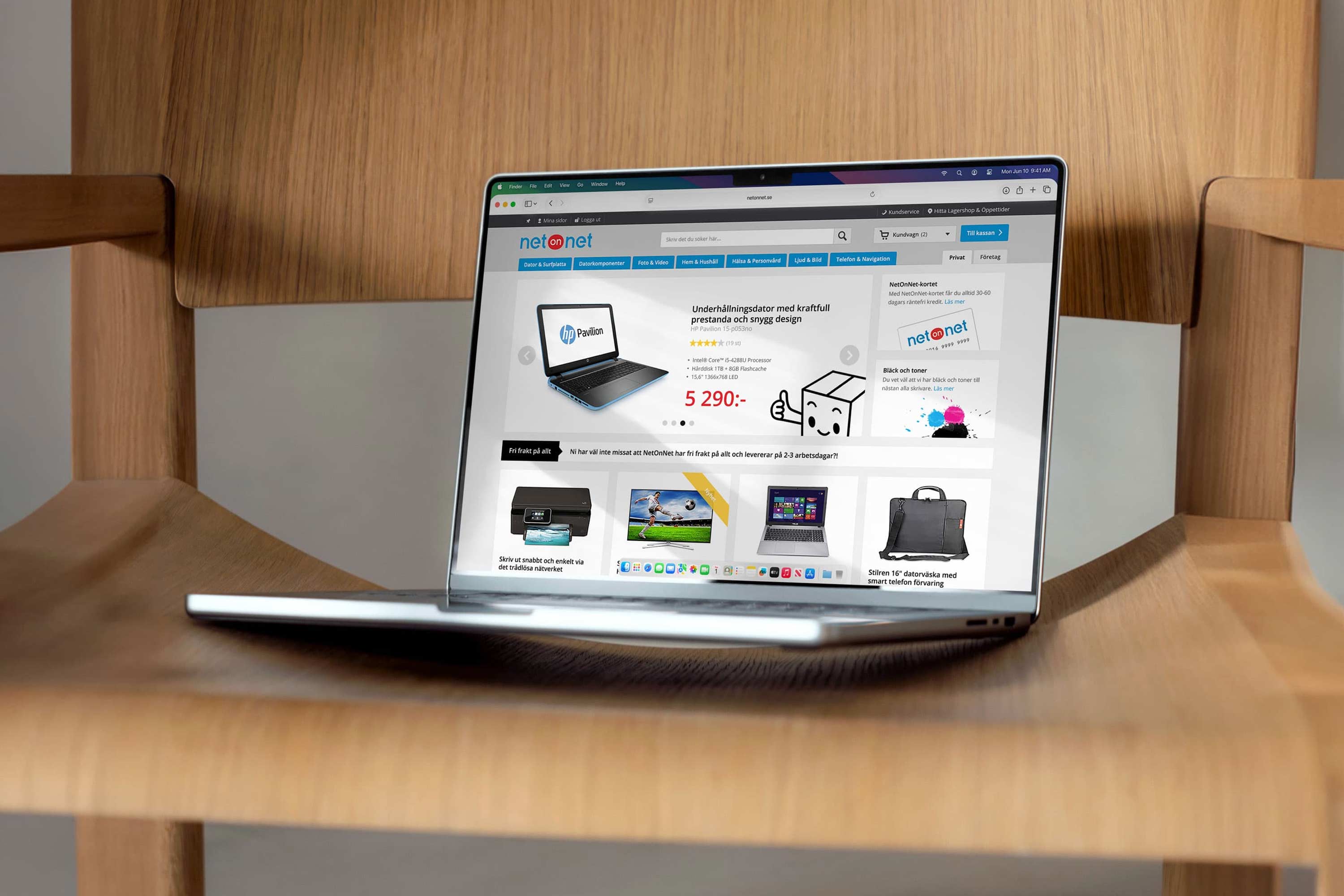
NetOnNet’s new website was developed with a clear goal: maximum functionality, minimal friction — whether the customer is using mobile, desktop, or the in-store touchscreens.
The starting point was the brand promise, “Directly from the warehouse shelf.” The experience needed to be fast, clear, and consistent. The previous non-responsive structure was replaced with a unified, fully responsive solution adapted for all screen sizes.
The interface is understated and straight to the point. Clear hierarchy, generous click areas, and easy-to-scan product listings were prioritized over decoration. The focus was on orientation, pace, and relevance.
A design that doesn’t try to impress — it’s built to function.


“What I appreciated most about Alexander was how quickly he became part of the team and started delivering. He is straightforward, humble, and always keeps the end user in focus. Thanks to him, we were able to raise both the quality and the pace of the project.”
Jonathan SvärdSolutions Architect